This guest post is by Tommy Walker of?Tommy.ismy.name.
?How do I get more people to interact with my stuff??
It?s a question I ask myself constantly. I could go on all day about traffic strategies, guest posting, or any number of online marketing topics. But the truth is, at the end of the day, shares, subscribes, and leads, are just another conversion.
I wish I realized that when I designed my existing website. I wish I realized a lot of things when I designed my website.
See, when I first started my site, I hadn?t thought about things like list building, or selling things (I had nothing to sell) or even the type of content I was going to publish. I thought I?d figure that stuff out as I went along, but, as my style changed, every new thing started to feel like it was tacked on.
Sadly, my site has become this clumsy Frankenstein creature that haphazardly attempts to do my bidding, but never quite executes. That?s no discredit to my developer, who did an excellent job at the time. It was my own misguided direction that turned what could have been a beautiful creation into something hideous.
Learn from your mistakes
If you?ve been following this series over the last couple of days, you?ll know that we?ve talked a lot about learning from your mistakes?as they affect your free or paid offer, and your conversion funnel.
I worked through these processes myself, so that as I go to work on version 3.0 of my website, I know exactly what I want my conversion goals to be. And they?ll be reflected in every facet of the new design.
The new design isn?t yet operational, but if you?ll allow me to let you peek under the sheet, I?ll show you:
- my conversion goals
- how I plan to attack them
- screenshots of the current design and what isn?t working.
- screens of the new design and why I think it?s an improvement
- what I plan to test.
Expect this post to be on the longer side, as it is meant to be a conversion-oriented website playbook. For your convenience, here?s a table of contents:
As we go through each section, I?ll also point out things to look out for on your own site, and ways that you might be able to fix them.
A quick note before we continue: Conversion optimization is about constant testing. Everything from copy, to layouts and button placement, and color schemes.
While I might give you some suggestions along the way, there is no one ?surefire? way. Often times what works best?is the thing we least expect and if sell yourself short on your testing, you may never know what actually works best for you.
The Web Marketing Ninja will be showing us the complete process of setting up and running A/B (or split) tests tomorrow, so if you want some expert advice on that topic, stay tuned.
Become really friendly with your analytics
Now, before I get to the design, I want to dive deep into my analytics.
As we?ve seen over the last couple of days, patterns in the data give a great starting point for the areas of your conversion funnel that can be improved, and even provide hints for how to improve them.
For instance:
- Posts designed to drive conversation and high ?time on site,? but which have few shares or interactions, may be lacking a clear sharing mechanism; alternatively, the comment call to action may be lacking.
- Sidebar offers that receive traffic, but don?t convert, may need to be redesigned or scrapped entirely.
- Landing pages with high time but few conversions require further testing to improve conversions.
- Common click paths users take can determine pages that could be optimized for subscriptions or sales.
Your analytics tell the story of you and your users. When you fix your part, they?ll be able to give you more of what you want.
Define your conversion goals early
I imagine we?re a lot alike, you and I, in our goals. Mine are:
- get more social shares
- build a bigger subscriber base
- attract more qualified leads that can be turned to sales.
What I didn?t realize on the first two iterations of my website was that each goal can be attacked very strategically within the design.
So instead of trying to get every page to do every thing, as I create version 3.0 of my website, I will be looking at each aspect with a different conversion goal in mind.
Goal #1: Get more social shares
The first goal, get more social shares, is pretty straightforward.
According to my analytics, my weekly blog articles get the most steady traffic and the highest time on site (four to seven minutes; I primarily video blog).
Knowing that, I want that traffic to turn into more traffic, because right now, the social sharing on the site is low.
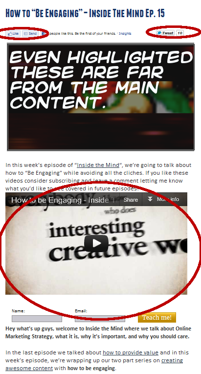
With the time on site being so high, my best guess is the posts aren?t getting shared because the sharing functions are a little less than obvious.
The trick to getting more social shares is two-layered.
- Create engaging content.
- Make sharing as painless as possible.
According to my video analytics, just over 70% of people watch my videos through to the very end. Looking at the current design however, it?s incredibly clear that sharing is not painless.
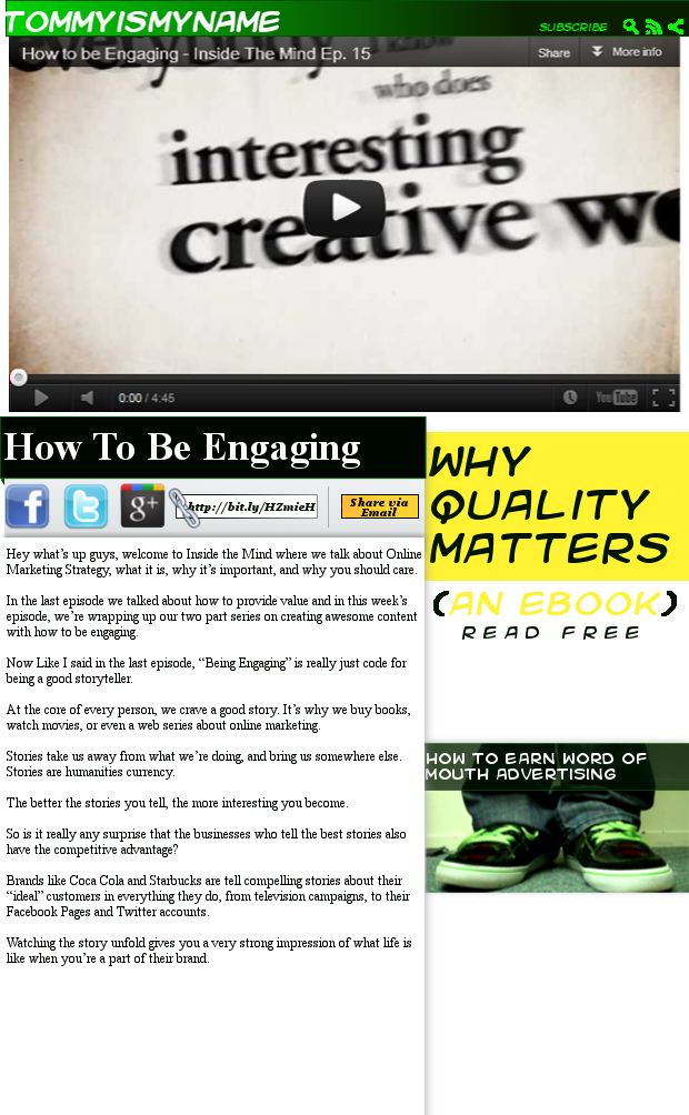
To address this in the new design, on an individual post page, the video will be featured at the top, filling most of the screen, and the sharing icons will be featured on the bottom left, just before the fold.
Next to the share icons will be a short link that can be copied to the clipboard with a single click.
Next to that, I?ll show a Share Via Email button that, when clicked, will drop down an email form where users can email the page link without ever leaving the site.
Key takeaway:
To improve shares on individual blog posts, create excellent content, and make sharing the primary call to action.
If the sidebars on your individual pages aren?t selling products, or bringing in email subscribers, get rid of those calls to action.
Something you can do right now is install the ShareThis hovering share bar and have it appear on all of your sharable content pages.
What I?ll be testing:
In order to get maximum shares, I?ll need make sure the sharing icons are in the most optimal positions on the page.
My tests will include:
- the share icons being located on the left of the page (as pictured)
- share icons on the right of the page
- the ?share bar? taking up the full width of the page below the video.
To do this, I?ll have my developer run a test using Google Website Optimizer, and track the results. (As I mentioned, the Ninja will show you how to do this yourself tomorrow). The layout with the most shares will win.
Goal #2: Increase email subscriber base
There are a few ways I plan to build my email list. Pay close attention here, because each and every one of these ideas is something you can do, too.
Email subscriber plan 1
The first tactic is persistent navigation throughout the site. This feature allows the top navigation bar on your site to remain in view as the user scrolls down the page. With persistent navigation, the fundamental action points are always in view, and available to users.
Persistent navigation seems to be where forward thinking websites are headed (Facebook, Google+, Lifehacker, WordPress). Using persistent navigation through my site allows me to create a subtle call to action that stays with the user.
On the above image, you may have noticed the word ?subscribe? in the navigation bar.
![]()
I believe this will eliminate the need to create a big, obtrusive opt-in form to occupy the sidebar (but this will need to be tested, of course).
When the user hovers over the ?subscribe? button, a dropdown with an opt-in form will appear:

In my opinion, this makes the website a little more ?fun? to interact with, which leads me to believe this will increase actual engagement with the site, and, thereby, email subscriptions.
Key takeaway:
The web is evolving much faster than most people realize. Incorporating elements like persistent navigation and interactive elements gives your website more depth than text and images alone. The more you give your users to ?play? with, the more likely they will want to hang around on your blog, and hear more from you.
If you?re code junkie, this tutorial?will teach you how to create your own persistent navigation menu.
Or, if you?re afraid of code (like me), you could always install the Hello Bar.?While it?s not as full-featured as custom navigation, it has been proven to increase clickthrough rates for many of its users, and can be very effective when you use the right messaging.
What I?ll be testing:
I?ll test the messaging within the dropdown itself: ?New episodes every week + exclusive bonuses? with ?Submit? or ?Subscribe? as the call to action, vs. ?Learn online marketing and get exclusive bonuses? with ?Teach Me!? as the call to action.
Email subscriber plan 2
According to my analytics, my homepage is usually the second stop people make when visiting my site ? makes sense.
Sadly, also according to my analytics, this is where my traffic goes to die. My homepage isn?t really optimized for anything.
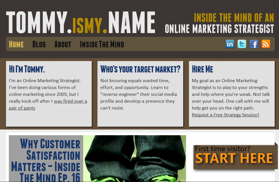
Realistically, my conversion goals for this new homepage have to be two-fold:
- Capture users? email addresses.
- Pull people deeper into the content.
To capture email addresses, I?ll be using a slightly modified approach to the ever popular Halpern Header?on my homepage.
Instead of using a static image, however, there will be a welcome video that?ll introduce visitors to the site and talk about the exclusive bonuses that come from being an Inside The Mind subscriber.
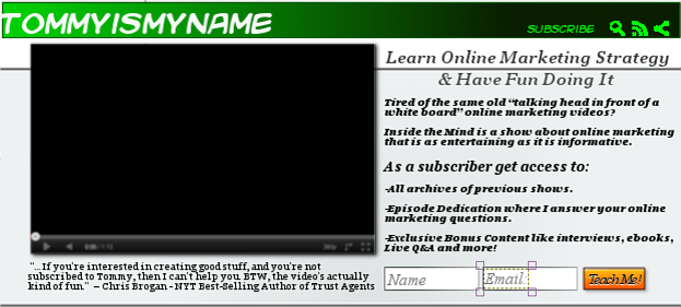
I believe that combining the Halpern Header with video will make the email subscription call to action both unmissable and fun to interact with.
As long as I?m able to clearly communicate the benefits of being a subscriber, I think this will lift subscription conversions dramatically.
Key takeaway:
The homepage is often the second most visited page on your website. If you?re not maximizing your email efforts here, first time visitors may never return. This is why it?s important to clearly communicate the benefits of your site, and make your opt-in form highly visible, not banished to your sidebar.
The Halpern Header/feature box method has been proven as an effective way to increase email subscriptions, for some by as much as as?51.7%.
Adding a personal touch like video or an image of yourself can build trust with your potential subscriber, increasing your conversion rates even more.
What I?ll be testing:
While I have a hunch that a welcome video will work well, it?s also possible people might find it more distracting than welcoming.
For that reason I?ll be testing a welcome video vs a welcoming image. I?ll also be testing layout with the video/image orientation on the left vs. the right, the copy, and the call to action.
Homepage Subgoal: Bring visitors further down the rabbit hole
Sadly, after visiting my homepage, most people?drop off the site.
To address this, I will feature a scroller of randomized content from season one of my video stream directly underneath the feature box.
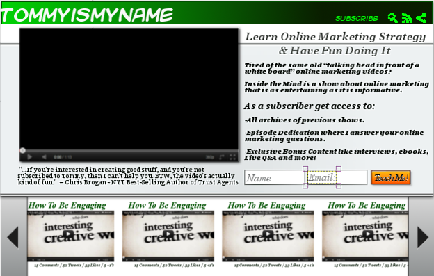
The reason for randomization is that it?ll mean that deeper (or older) content can also get some play.
Copyblogger uses a similar approach with the ?popular articles? list on their sidebar. Using randomization, a fun slider, and engaging?thumbnails for the posts just takes that idea a step further.
Note: The bar will never show posts that are also displayed in the main feed below. Rather it will only show content from deeper pages. This way, I can avoid duplicate content issues?I won?t be trying to push the same article in a handful of different ways.
Below that, I?ll show a fairly standard format blog, with reverse chronological posts on one side, and an offer for my ebook on the other.
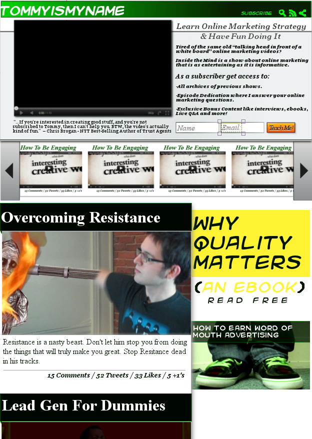
You may notice that everything seems to get a little bigger once we get into the main feed.?The reason for that is fairly simple. The top of the site will act like a built-in landing page, but once a visitor goes below the fold, the focus will be on content.
The sidebar will display only two items at any given time, and will also be a persistent part of the interface once a certain scroll threshold is reached.
At the top, I?ll include a lead generation piece/ethical bribe (more on this later). Underneath that, a randomly generated episode link will appear (again, only one that is not currently present on the page).
Key takeaway:
If your homepage isn?t working to drive people back into your content, switch things up using your analytics as a guide. Just be sure to talk about it before hand so your faithful visitors don?t think something bad happened to you!
What I?ll be testing:
Not much here actually, but I will be measuring pretty heavily what content, in what position, gets the most clicks.
As far as I know, this is nothing remotely close to a ?standard? blog format, so it will be interesting to see how people respond to features like the scroller and persistent navigation.
Email subscriber plan 3
Taking another leaf out of Derek Halpern?s book, I will have email optins in three critical places:
- the About page
- the footer
- at the end of the single post pages.

Normally, I would recommend placing an opt-in on the top of the sidebar. However, because I am using persistant navigation with ?the Subscribe link in prime view at all times, I feel, for me, that this space is better used for lead generation.
The About page
I plan on doing something a little different by putting the link to my About (and other) pages in the footer. This is more like a news site, and less like other online marketing blogs.
Keeping that in mind, the people who come to the About page will need to do a little more digging to get there. So why don?t I try to capture an email address in the process, since we?re getting a little more personal?
This is what Derek says about the About page:
Prime people for your website?s content and why it?s important
- Opt-in form
- Show social proof
- Opt-in form
- Show personal backstory
- Opt-in form
For backstory, I plan to share a bit of my background as an actor, how I was fired over a pair of pants, how that eventually lead to online marketing, and the ups and downs I?ve seen while working for myself (there have been many).
Key takeaway:
When you address your users? search intent first, then make a personal connection by sharing more about yourself, you give visitors more than one reason to subscribe.
What I?ll be testing:
The copy is what?s going to make the difference here.?While it might not be a part of my initial relaunch plan, I?d also like to test using a cinematic ?trailer? video that prompts visitors to ?Join the journey? by becoming an email subscriber.
The footer
There?s a very simple reason for revamping the footer to include a subscription CTA. If someone?s scrolling to the bottom of the page, you can assume one of two things:
- They?ve read through all of your content and are primed to want more.
- They just like scrolling.
Either way, the footer is a great place to capture email, because your reader has gone all the way to the bottom of the page (and there?s nothing left to do).
Currently, I have an opt-in form in my footer, and it converts pretty well.

What?s lacking in this footer, and on my current site as a whole, for that matter, is a page that is dedicated to explaining the benefits of becoming a subscriber.
That?s why, instead of including an opt-in form in the new site footer, I will instead include a link to a landing page called Why Subscribe?

This again comes down to a matter of search intent. Where most of my content is going to be front-and-center in nearly aspect of the design, I can only suspect that the people who scroll to the bottom of the page are more ?deep information? types.
I believe many blogs do not reward these types of people, and instead only go after those who are willing to hand over their information with little friction.?However, the ?deep information? types aren?t so trusting. They need to have all of the information before they give up any personal details.?That?s ok with me, because they also do a good amount of homework before making purchases, and I?ve found to be the most-action oriented customers.
So instead of giving them nothing to do when they scroll to the bottom, I will give them a landing page that talks about all of the benefits of subscribing to the show. This page will include information on how frequently emails are sent, the types of bonus content they can expect, and an outline of what will be included.?Doing this also gives me another page that can be linked to from internal content, which is a nice bonus!
Key takeaway:
Keep your users? intent in mind, and create content that appeals to as many different types of readers as possible. If you don?t currently have some form of a ?why subscribe? page on your site, you?re not addressing all?of your readers? concerns.
What I?ll be testing:
I?ll be interested to see the difference in conversion between the footer opt-in box and the Why Subscribe? link.
Giving users one extra click may decrease the overall conversions, however the link to the landing page is more in line with user intent on that particular section of the page.
Either way, I?ll have more data on footer and landing page subscribers, which will help me focus my follow-up messages even further.
End of single post pages
This is fairly straightforward.?If someone has decided to take the time to read through the content, they?re probably a good candidate to become a subscriber.?So I?ll create a subscription option at the end of every post.

Key takeaway:
We often clutter the end of our posts with all sorts of garbage, like related posts, share buttons, subscribe to my email list, read my bio, leave a comment, and more.?Every single one of these commands is a call to action, and the more calls to action you have, the more diluted each one becomes.?Find ways to incorporate all of these things?just don?t cram them all in at the end of your posts.
Using a WordPress plugin like Post Ender, you can keep your calls to action focused, and will likely see higher subscription rates from the ends of your posts.
What I?ll be testing:
Not much more than the language: ?Subscribe,? for example, vs. ?Keep Me Updated.? Because my content is primarily video, and it?s?showcased at the top of the page, this form is one of the least of my concerns.
Email subscriber plan 4
This is it! The Dreaded Popup.?I believe there?s a classy way to use popups, and an annoying way.?You?re probably pretty familiar with the annoying way.
My plan with the popup, however, is to have it triggered after the viewer has been on the site for a given amount of time, or clicks within a set number of pages.?That way, I?ll know they?re engaging with the site, and are more qualified than, say, a first time visitor.
Personally, I hate the pop-up, so if I?m finding that it?s not converting, even when I target mostly engaged users, I will not hesitate to yank it.
Key takeaway:
Popups can be extremely valuable, but are often seen as annoying.?The longer people are on your site, the more likely they are to qualify as potential subscribers.
Although your conversion rates may go down the longer you wait to trigger the popup, your subscriber quality will increase, because they?ve already spent more time with you?they?re qualified subscribers.
What I?ll be testing:
Here, I?ll test headline copy, the optin orientation, click and time triggers, and a number of other things I exaplained in detail in this article.
Goal #3: Get more high-quality leads
Subscribers do not equal leads.
I repeat: subscribers do not equal leads. While subscribers may eventually become leads, signing up to be on your email list does not mean they have an interest in buying anything.
In order to gather more leads through the site, I intend to offer a free ebook titled Why Quality Matters,?in which we?ll explore different statistics on the state of the internet, how high-quality content excels, what defines high-quality content, and so on/
The landing page to ?sell? the book will follow this formula.
The book itself will follow a similar format, but remain informative throughout.
As it is ultimately a lead generation piece, the goal is to simultaneously attract the right people, and repel everyone else.?Not everyone who reads the ebook will recognize themselves in it, but those who do will find a link to request a strategy session?at the end of the book.
In the strategy request form, I ask questions of the reader, like how long they?ve been in business, their previous yearly income, target yearly income, and if there are any major roadblocks that prevent them from moving to the next level.
This process is designed to help a person really decide whether or not they need help.?Having had my prospects step through a handful of filters also saves me a lot of trouble ?pitching? my services to them. By the time we get on the strategy call, I can really focus on helping them.?I do have an offer, but I?ll only make it if it seems like it?ll be a good fit.
Key takeaway:
Qualify your leads. So many bloggers and marketers assume that list subscribers = people who might be interested in buying something eventually.?But every time a pitch comes around, a good chunk of people either unsubscribe or ignore you all together, causing this endless cycle of list rebuilding.
When you let people qualify themselves, and say ?I need help,? they?re more likely to open your messages and take action on what you have to say.
What I?ll be testing:
I?ll test the landing page copy, without a doubt. Using Premise, I?ll be able to apply the Google Website Optimizer to test headline and copy variations.?Also, I?ll be testing pure copy vs. video, to find out which will be the most effective ?pitch? on the landing page.?Even though the investment for users is ?free?, I?ll still want to put my best foot forward, due to the subject matter and the eventual lead into the sale.
Note: This is not the only way I will be generating leads. Far from it actually.?I?ll also use several paid and organic strategies to better target those exposed to my content.
I mention this because popular content marketing wisdom does not advocate paid advertising, but the truth is, there is no faster or more precise way to target the right people for your content.
Test, get feedback, iterate
The designs and tests above were all conceived to address gaps in my data. I?cannot stress to you enough the importance of knowing what your analytics are telling you, and testing to make improvements.
One thing I?ve learned ?is that intuition doesn?t convert well.?Yet data only tells you so much. That?s?why I?ll offer an incentive to my list?to get real people to ?test drive? the site.?Their feedback will be vital in making the necessary tweaks before I push the site live and test it with a larger audience.?And even when it?s fully live, there will always be testing taking place.
The name of the game is to always be improving, and iterating on what you?ve learned from previous tests.?Only let your data and user feedback drive your design. Tomorrow?s post?the final one in this series?will show you how to set up, run, and adjust your own A/B tests. I?ll be checking it out?and I hope you will too.
I?m sure that by now, this series has probably encouraged you to look at your offer, conversion funnel, and offer communications more critically. You?ve probably come up with a few ideas you?d like to try. Share them with us in the comments below!
Tommy Walker?is an Online Marketing Strategist and host of ?Inside the Mind? a fresh and entertaining video show about?Online?Marketing Strategy.
roger clemens apple earnings the glass castle jennifer hudson trial north korea threat brandon jacobs brandon jacobs


 Beginning as far back as October 2011, our team, ultimately winning the ?Entrepreneurs? Choice? award at the European finals in Oxford, learned to quickly understand business propositions, evaluate whether they offered an investible business opportunity, if so then draft under what terms the investment should be made, and ultimately recommend how the entrepreneur should proceed.
